
 EN
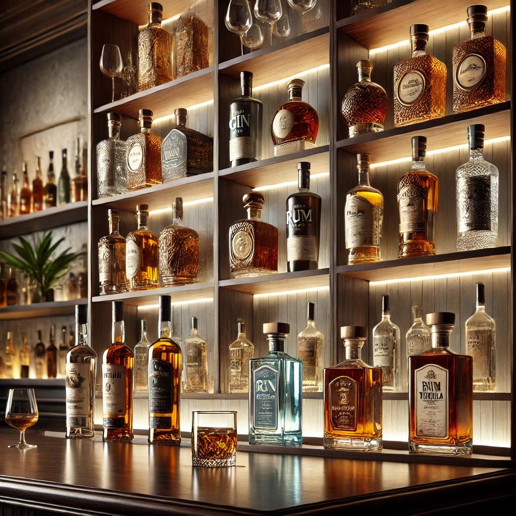
The Psychology Behind Colored Glass Bottle Appeal
Chromatic psychology: How hue, saturation, and opacity shape emotional response
Color is a silent communicator in packaging—shaping expectations before a product is even picked up. Hue directs emotional association: deep blue suggests calm and freshness; green signals organic or botanical character; amber conveys warmth and aged richness; violet implies rarity or creative depth. Saturation sharpens or softens that message—high saturation feels energetic and youthful, while lower saturation reads as restrained luxury. Opacity adds a third psychological layer: fully opaque bottles project permanence and protection, shielding contents from light, whereas semi-translucent tints invite a glance inside and build anticipation. Warm tones like amber and gold resonate with indulgence and heritage; cool blues and greens align with clarity and eco-conscious values. Leading package designers treat these chromatic variables not as decoration, but as a psychological primer—setting expectations for scent, taste, or efficacy before the consumer touches the container. This intentional use of hue, saturation, and opacity elevates perceived intentionality and premiumness.
Perceptual fluency: Why colored glass bottles feel more intuitive and trustworthy than clear or plastic alternatives
Perceptual fluency—the ease with which the brain processes visual information—strongly influences trust. A tinted glass bottle delivers immediate cues of structure, weight, and protection that clear glass or plastic often lack. Its colored surface reduces visual noise and presents a stable, finished silhouette, lowering cognitive load. Tactile reinforcement follows: cool, solid glass feels non-reactive and pure; lightweight plastic can seem disposable. Because the brain equates processing ease with familiarity and safety, consumers intuitively perceive tinted glass as more reliable. Deeper tint or opacity further suggests contents are shielded from light and time—implying longer shelf life and brand care around preservation. In crowded retail environments, this combination of visual coherence and material heft shortens hesitation and increases purchase confidence without explanation. It’s a quiet but powerful driver of premium perception.
Strategic Color Selection for Brand Identity and Audience Alignment
Green, cobalt blue, violet — decoding color-coded brand archetypes in premium packaging
Green, cobalt blue, and violet serve as visual shorthand for distinct premium archetypes. Green-tinted glass positions products within botanical, organic, or wellness categories—leveraging associations with leaves, herbs, and earth. Cobalt blue signals depth, purity, and technical confidence, making it common in mineral waters, apothecary lines, and precision skincare. Violet leans into rarity and creative luxury—frequently appearing in limited-edition fragrances and high-end spirits. Saturation matters as much as hue: muted olive reads artisanal and grounded; vivid emerald feels modern and dynamic. Opacity controls narrative control—fully opaque bottles heighten mystery and perceived value, while translucent tints offer a curated preview. Since color is processed before text or logo, the bottle itself becomes the first brand message. Successful selection anchors to an existing identity—not fleeting trends.
Matching chromatic properties to demographic visual processing: Age, culture, and eco-values matter
Demographic visual processing significantly shapes how tinted packaging is received. Younger audiences often respond to higher saturation and unexpected combinations, while older groups may prefer muted, familiar tones. Cultural context shifts meaning: white signals purity in Western markets but mourning in parts of Asia—so “neutral” clear glass isn’t universally neutral. Eco-focused consumers associate amber and green with recycled-glass cues, especially when paired with minimal labels and visible texture. Yet color alone cannot signal sustainability—the material’s recyclability must be communicated separately. Age also affects opacity preference: older consumers value legibility; younger ones accept experimental finishes. Testing across age, region, and value segments reduces the risk of costly misalignment. Packaging teams should therefore calibrate hue, saturation, and opacity to the visual habits—and values—of their intended audience.
Colored Glass Bottle Performance in Real-World Retail and Consumer Contexts
Shelf impact: Data-driven advantage — 68% faster visual capture and 37% longer dwell time (premium fragrance case)
In real retail conditions, a colored glass bottle acts as a rapid visual anchor—not just holding product, but commanding attention. A 2023 premium fragrance shelf-impact study found that colored glass packaging achieved 68% faster visual capture and 37% longer dwell time than clear or plastic alternatives placed on the same fixture. This advantage is critical: shoppers scan crowded shelves in seconds. Hue and opacity create a distinct silhouette that cuts through visual noise, while controlled light transmission adds depth and perceived quality. Amber, cobalt blue, and violet bottles signal premium authenticity before consumers read a single label claim—supporting faster emotional engagement in low-attention environments. Brands that test colored glass options under actual fluorescent retail lighting—not just digital mockups—can identify which chromatic intensity holds attention beside competitors. The result is a measurable lift in consideration at the point of purchase, rooted in visual processing science and decision-making behavior.
Balancing Aesthetic Premiumness with Sustainability Credibility
Sophistication and sustainability need not be opposing goals. Colored glass bottles can incorporate high percentages of post-consumer recycled cullet while preserving rich, uniform hue and depth—qualities that signal premium craft. Mineral-based colorants and controlled furnace conditions ensure deep greens, cobalt blues, and violet ambers remain stable across recycling cycles, reducing virgin material demand without visual compromise.
The premium feel emerges from tactile and visual details—not disposable layers. Heavier base weight, softly polished shoulders, debossed monograms, and subtle gradients convey permanence and care. These cues align with sustainability when the bottle is designed for reuse or refill: a durable colored glass vessel encourages multiple returns, lowering total packaging footprint. Natural earth tones—forest green, smoked grey, warm brown—bridge luxury aesthetics and ecological values without relying on plastic coatings or mixed-material labels.
To maintain credibility, brands should specify recycled content transparently and select mono-material closures—or easily separable components. Clear on-pack communication about recyclability and return schemes reinforces that premium perception is built not on waste, but on longevity, material integrity, and thoughtful design.
FAQ Section
Why are colored glass bottles perceived as premium?
Colored glass bottles signal premium authenticity by providing visual, tactile, and psychological cues, such as structural integrity, weight, and color associations with clarity, luxury, and quality. They also evoke trust through perceptual fluency.
What psychological factors influence the perception of colored glass bottles?
Hue, saturation, and opacity play crucial roles. For example, warm tones like amber convey heritage, while cool tones like green or blue suggest eco-consciousness. Opacity reinforces protection and premiumness.
How does demographic targeting affect colored glass bottle design?
Different demographics respond to varied hues and opacity levels. Younger audiences may prefer vibrant, high-saturation colors, while older demographics value muted tones and legibility. Cultural and eco-conscious factors are also critical considerations.
Can colored glass bottles be sustainable?
Yes, using post-consumer recycled cullet and eco-friendly designs, such as mono-material closures and minimal labels, can improve their sustainability. Reusable and refillable designs further promote ecological values while maintaining aesthetics.
What is the shelf impact of colored glass bottles?
Colored glass bottles have a measurable retail advantage, with studies showing up to 68% faster visual capture and 37% longer dwell times compared to clear or plastic options, effectively driving purchase decisions.